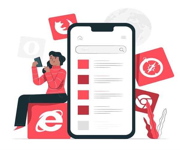
How can we make our site mobile friendly
There are some key techniques that make your site mobile-friendly. These techniques include CSS grid layouts, dynamic serving, and eliminating pop-up windows. You will also want to make sure that the content on your site is optimized for all devices. Most mobile-friendly sites also use media queries to display content in the right way on all devices.
Dynamic serving
One option for creating mobile-friendly websites is to use dynamic serving. This technique works well for websites with multiple mobile-friendly options. This allows users to view the same content on different devices, and the web page will load more quickly on smaller devices. However, this method can create problems for some users.
One of the biggest drawbacks of dynamic serving is that the pages will not render correctly on all devices. The dynamically served pages may not be as attractive on all devices. In such cases, a dedicated mobile-friendly site may be the best option. It is possible to create two separate versions of a single web page, but you'll need to be diligent about keeping up with gadget releases.
Dynamic serving is a good choice for sites with complex interactions that need to be viewed on different devices. But if you're just creating a site that sells products or is purely content-based, dynamic serving may not be necessary. In this case, media queries should be used to tailor visuals to the mobile screen.
CSS grid layouts
Whether you are creating a mobile-friendly website for your own needs or creating a site for a client, CSS Grid Layout is a powerful tool to help you achieve your goals. It provides a visual transformation that enhances the user experience and establishes your brand as an authority in your line of work. In addition, it can help generate qualified leads for your business. There are many benefits to using CSS Grid Layout, including responsiveness and the Page Experience Update by Google.
One of the most effective features of CSS grid layouts is that they are flexible enough to make your site mobile-friendly. For example, you can resize your content without affecting its width. You can also change the font and style of your site without having to change the layout.
You can also track certain behaviors of users with a bunch of WordPress plugins.
Eliminating pop-ups
Eliminating pop-ups on mobile websites can be done with several methods. You can use your browser's built-in pop-up blocker to block pop-up windows. However, this method can only block windows that automatically open. These windows may contain a virus or other harmful content.
One of the most common methods of eliminating pop-ups on mobile sites is to use mobile-targeted messaging. This can be done by using light text without icons and images. In addition, you can use this technique when you want your visitors to perform tasks such as research or shopping. In addition, you can use a modal pop-up to display a special CTA. However, make sure that it is not so intrusive that it interrupts their on-site experience.
Another way of eliminating pop-ups on mobile sites is by using third-party applications. One such application is Adblock Plus. Although Adblock Plus has mixed reviews, it allows users to customize their online experience by turning off intrusive pop-ups and displaying only non-intrusive ads.
Media queries
When you're making a site mobile-friendly, you need to make sure it uses media queries. These are CSS rules that let you ask a web browser what size the content is for different devices. Most mobile-friendly websites make use of media queries, but if you want your site to be as mobile-friendly as possible, you need to ensure that your CSS is set up correctly for all devices.
One common example of how media queries work is to change the style of your menu. For example, a horizontal menu is useless on a mobile device because the buttons will be too small.
Responsive web design
Responsive web design focuses on making elements and layout blocks responsive to different screen sizes. The size of the text, for example, should be adjusted to match the device's screen. The easiest way to do this is to use media queries. You can also set a static value for font size, but you should remember to use commas to separate multiple text elements. You can also use Google's mobile-friendly test to ensure that your site is responsive.
Mobile-friendly websites should be responsive because they change their appearance when the user's device changes its screen size. This way, they remain usable for mobile users and do not lose content or functionality. In addition, a responsive site should load faster to reduce bounce rates.

I am Drishan vig. I used to write blogs, articles, and stories in a way that entices the audience. I assure you that consistency, style, and tone must be met while writing the content. Working with the clients like bfc, varthana, ITC hotels, indusind, mumpa, mollydolly etc. has made me realized that writing content is not enough but doing seo is the first thing for it.